UX Researcher & Designer
Team of 2
January - March 2026
Design Systems
Responsivity
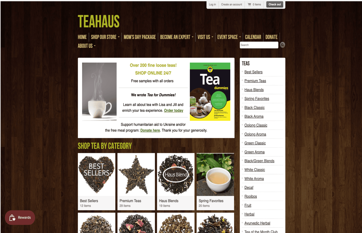
TeaHaus
Clear entry into browsing
High quality product pictures
Plenty merchandise available
Extensive subpages
Outdated appearance
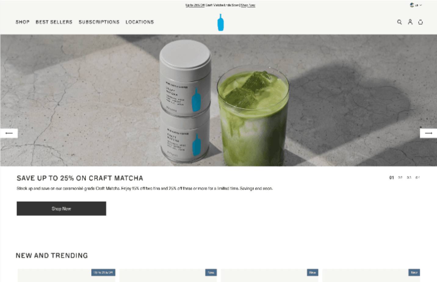
Blue Bottle Coffee
Layout & photos with brand
Simplified navigation
Easy to locate cafe
Brand character
Brew guides tucked in footer
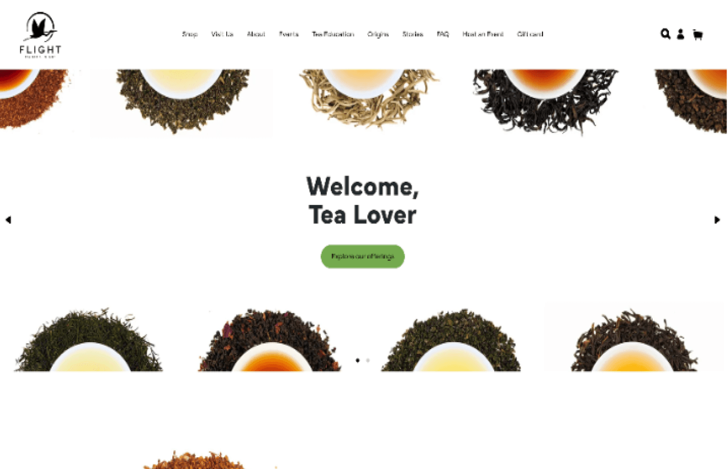
Flight Tea Bar
High-quality photos of tea
Easy to navigate shop page
Missing cafe address
Text color contrast failure
Color
Primary
Default
Light
Subtle
Darker
Secondary
Default
Light
Subtle
Darker
Success State
Default
Light
Subtle
Darker
Error State
Default
Light
Subtle
Darker
I engineered a semantic color system using Figma variables, mapping colors to tokens like "Success" and "Error" as well as “dark” and “light.” This logic-based approach automates UI states and ensures a scalable, dev-ready palette.
Logo
I refined the brand’s visual identity by transitioning from a dated, enclosed crest to a clean, minimalist wordmark. This enhances digital scalability and legibility while maintaining the charm of TeaHaus.

Components

Buttons
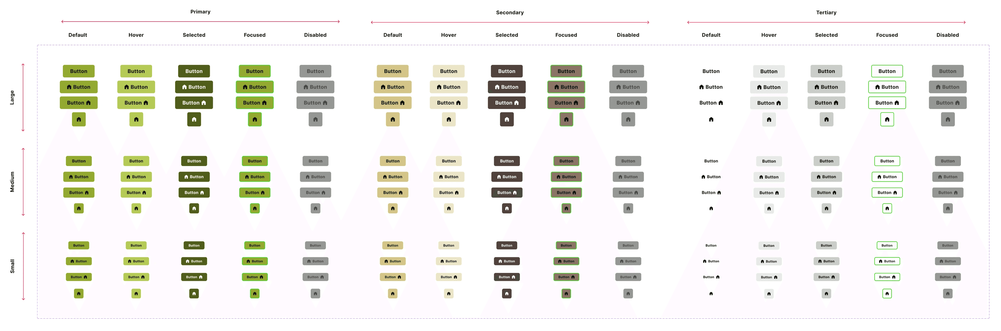
Scalable Templates

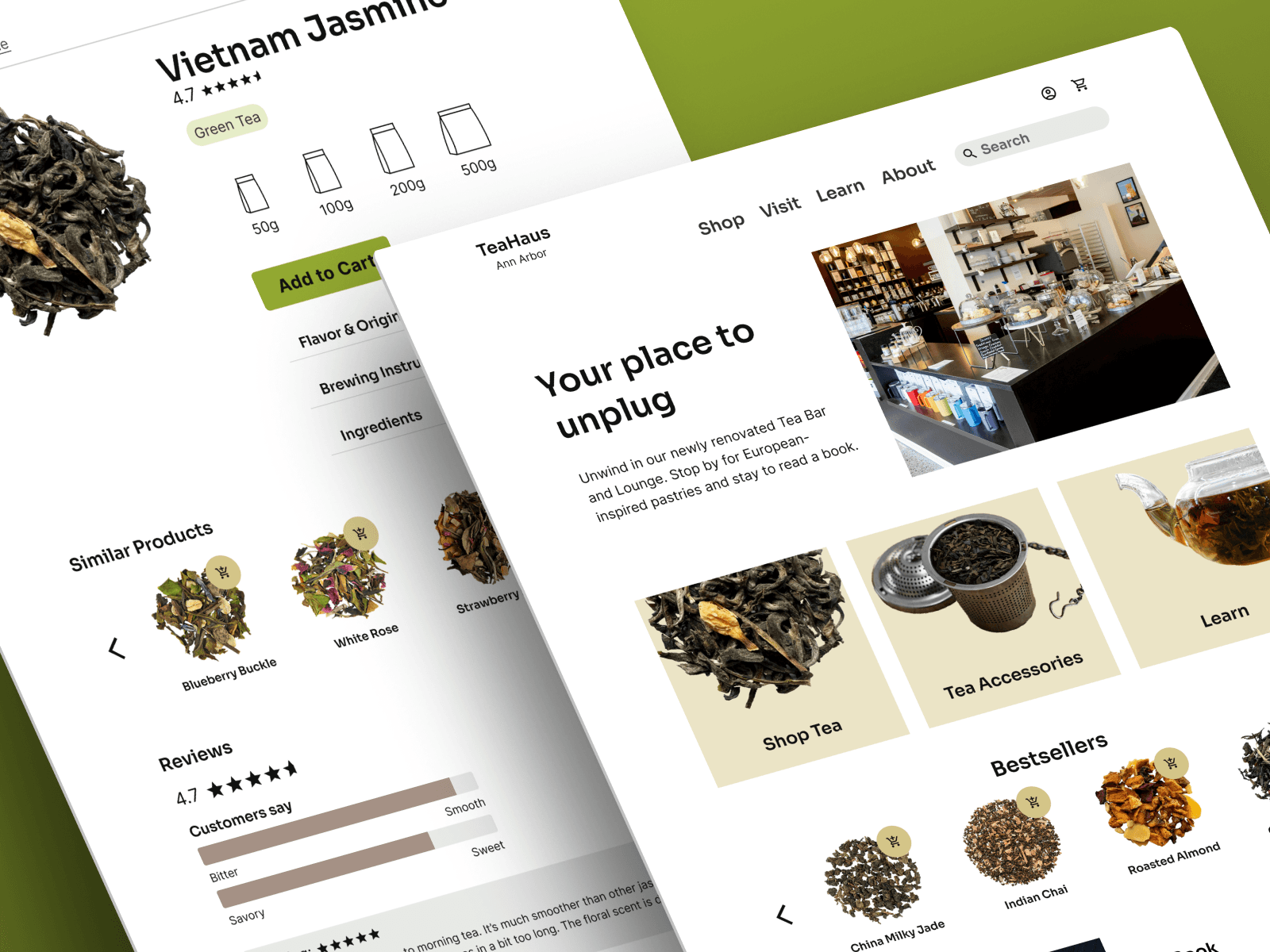
Menu-style homepage
Help customers explore online and in-person offerings without overwhelming them.
Simplified browsing
Increase trust and usability by utilizing a clean, responsive look in-line with other cafes.
Type & color updates
Bring the charm of the TeaHaus lounge to their online website experience.
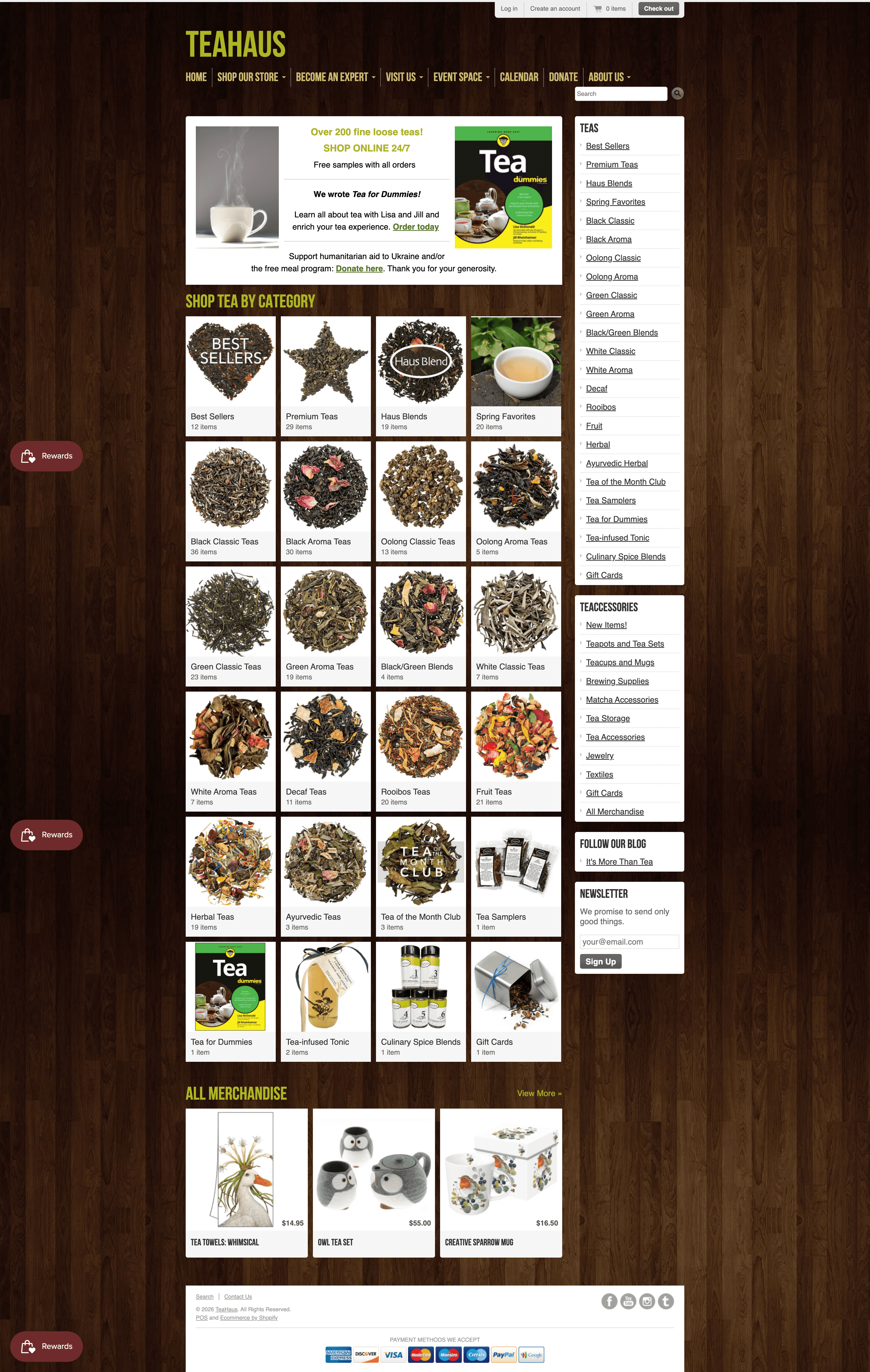
Homepage - Before
Overwhelming nav menu options
Duplicative list and menu-style layout of teas
No location or hours on homepage
Outdated visual appearance
Homepage - After
Reduced & simplified nav options
Menu-style offers accessible entry points to primary site pages
Modal pop-up for return shoppers who want a quick experience
Hours & location added to footer
Homepage (Mobile) - Before
Extremely small touch targets (top bar & nav specifically)
No collapsed nav menu
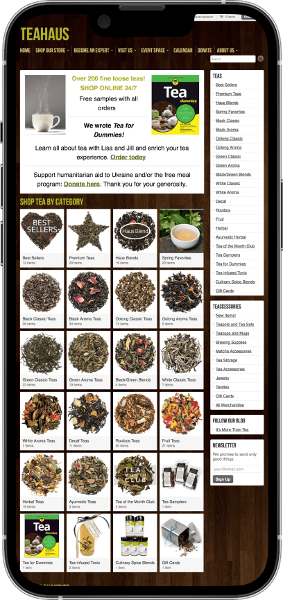
Homepage (Mobile) - Before
Collapsed nav to hamburger menu for simplicity and adhesion to mobile mental model
Cart and profile accessible in top nav bar to improve discoverability
Horizontal scrolling leveraged for tea browsing
Product Page (Mobile) - Before
Extremely small touch targets for size dropdown
Low visibility CTA button "Add to Cart"
Large chunks of text descriptions
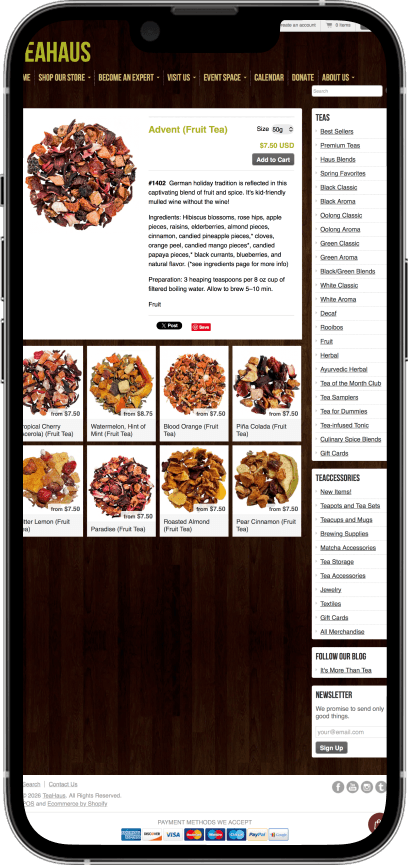
Product Page (Mobile) - After
mobile-friendly sizing of elements and touch targets
bag illustration for clear CTA for user
high visibility CTA "Add to Cart" button
Reviews included for customer satisfaction data
Product Page (Mobile) - Before
Extremely small touch targets for size dropdown
Low visibility CTA button "Add to Cart"
Large chunks of text descriptions
Other Layouts (Mobile) - After
Spacing, color, layout adjustments that improve clarity of information and browsing functions
Simplified and streamlined checkout within TeaHaus platform (current website links to Shop e-commerce platform
Dark Mode - After
Leveraged Figma tokens to swiftly shift between light and dark mode seamlessly
Design-to-Code
I prioritized developer-friendly handoffs by mirroring technical workflows in Figma. I learned the importance of semantic naming and tokenization: to bridge the gap between creative vision and implementation.
Atomic Consistency
Building from the ground up reinforced the value of atomic design. I established foundations like color and type first, before creating components—ensuring a consistent and easy to maintain design system.
Sara Carrier
copyright © 2026