UX Researcher & Designer
Team of 4
January - March 2026
Information Architecture
Civic Tech

information chunking
tags/filters enhance search
aesthetics (color & white space)
Extensive text on some pages
Few complex resources
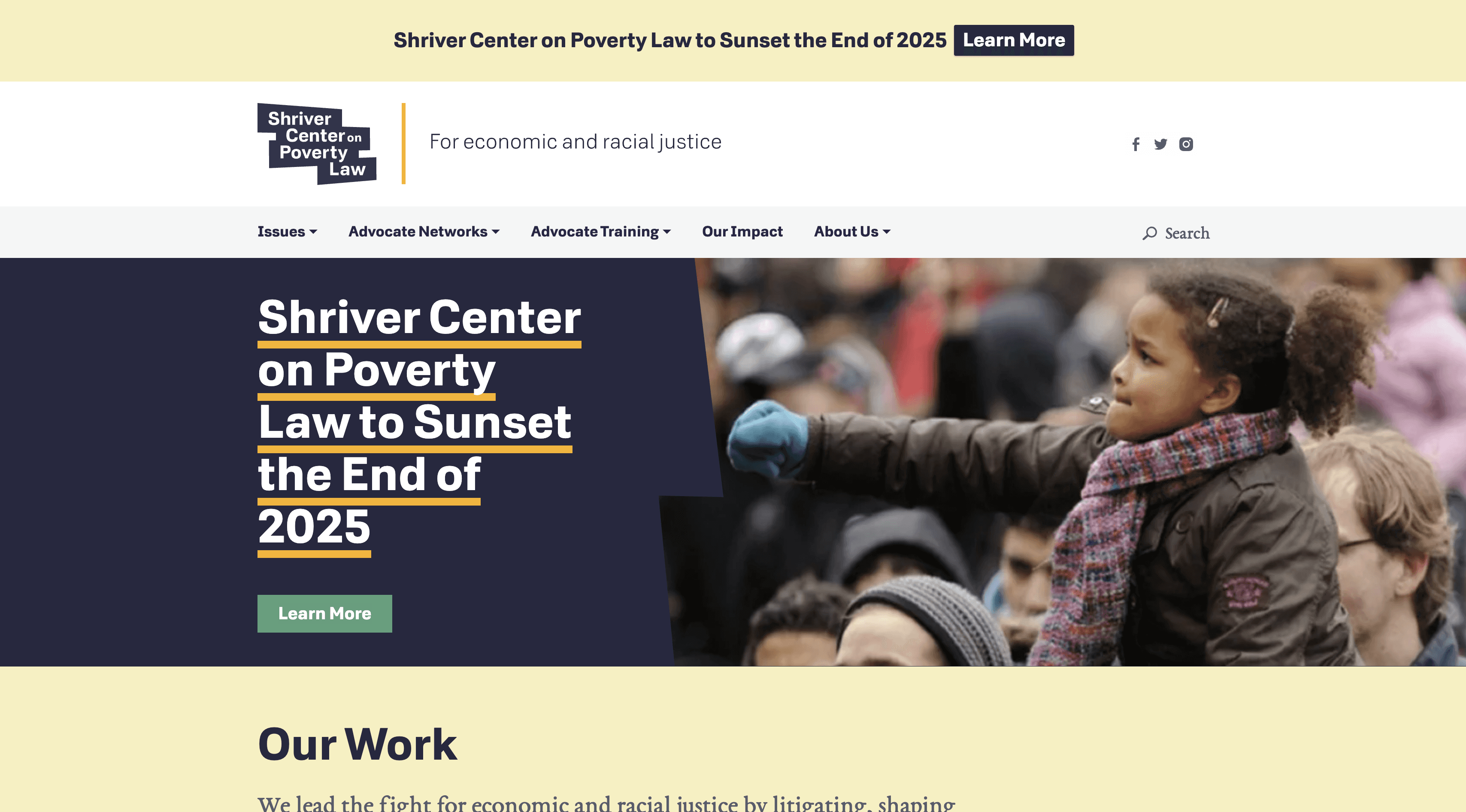
Layout & color-blocking
Simplified navigation
Page subheader descriptions
Related content linked on pages
Small text decreases readability

Bold & simple UI
Memorable color gradients
Consistent branding & UI
Mixed text alignment
Large text chunks


The team divided Nielsen's heuristics and evaluated the current MPLP website against them. We then analyzed the data before synthesizing findings.
My Heuristic Evaluation Findings
Login: inconsistent labels, buttons, and links for login across various pages
Filtering: Lack of filters for parsing trainings and resources
CTAs: Inconsistencies in color and style make them difficult for users to identify
Content Density: Dense layouts reduced readability
Information Hierarchy: Weak organization and prioritization
Accessibility: Low contrast reduced link visibility
Layout: Inconsistent page structures and spacing
Search: Unclear search errors and empty states
Error Messages: Technical and inconsistent error feedback
Forms: Missing inline validation and recovery guidance
Event Details: Incomplete meeting information

Primary Entry Points: The vast majority of new users enter the site directly (4.7K users) or via organic search (1.4K users), with social and referral traffic representing a minor fraction of overall visits.
High-Demand Content: Beyond the homepage (the primary entry point), Jobs and Legal Update pages (e.g., SNAP Work Requirement Updates) consistently generate the highest traffic volume and engagement.
Streamline Access & Authentication: Re-evaluate content permissions and simplify the login process to prevent users from hitting dead ends.
Optimize High-Traffic Pathways: Improve navigation and call-to-action (CTA) visibility on the homepage and legal update hubs to guide users smoothly toward open resources.

To better understand MPLP’s users and their experiences, my team conducted 9 semi-structured interviews, with each team member leading a portion of the sessions. We explored how primary users interact with MPLP, how they access training materials and registration, and their perceptions of the current website experience. After completing interviews, we synthesized our findings through an affinity mapping process, conducting three rounds of sorting to identify patterns, themes, and key insights across user feedback.
Key Opportunity Areas
Streamline Authentication: Implement Single Sign-On (SSO) to remove login friction.
Unique Login: Provide unique logins for all users, removing frictions around shared login.
Self-Service Recovery: Simplify password resets and account troubleshooting.
Better Search & Filters: Improve search accuracy and tagging for faster retrieval.
Personalized Feeds: Surface relevant and newly published content on user dashboards.
Clear Navigation: Reorganize content hierarchy to reduce clicks and highlight resources.
Centralized Calendar: Provide a unified schedule with easy calendar integration
On-Demand Archives: Make recorded sessions and materials easily accessible.
Scannable Page Structure: Highlight key details so users can scan training pages.


To determine what to tackle first, we mapped our recommendations on an Impact vs. Effort matrix, grouping ideas into four categories: Quick Wins, Big Bets, Maybes, and Time Sinks. This framework helped us prioritize improvements that would deliver the greatest value while making efficient use of development resources. In addition, the matrix serves as a helpful reference for our MPLP stakeholders as they determine resources needed to enact usability adjustments on their site.
Quick Wins:
Our immediate focus centered on improvements to the training section, the site's most frequently used resource. Key recommendations included:
Add filtering, sorting, and tagging to improve content discovery.
Introduce a calendar view for upcoming and past trainings.
Reposition the "Donate" CTA to reduce distraction during content exploration.
Consolidate overlapping content to eliminate redundancy.
Big Bets:
Longer-term initiatives focused on improving the overall information architecture and user experience:
Clarify content categories with dedicated overview pages.
Improve article filtering and search functionality.
Restructure text-heavy pages into more scannable, audience-focused layouts.
Simplify the login experience through clearer access pathways.
Explore community features, such as discussion forums, to encourage knowledge sharing.
Maybes:
Lower-priority enhancements included refining the visual design system and addressing smaller usability issues:
Improve consistency across buttons, typography, grids, and color usage.
Fix dead links and surface more relevant information on training listings.
Time Sinks:
We deprioritized initiatives requiring significant effort with limited short-term impact, such as a complete redesign of the site's architecture, allowing the team to focus resources on higher-value improvements first.
My Contribution
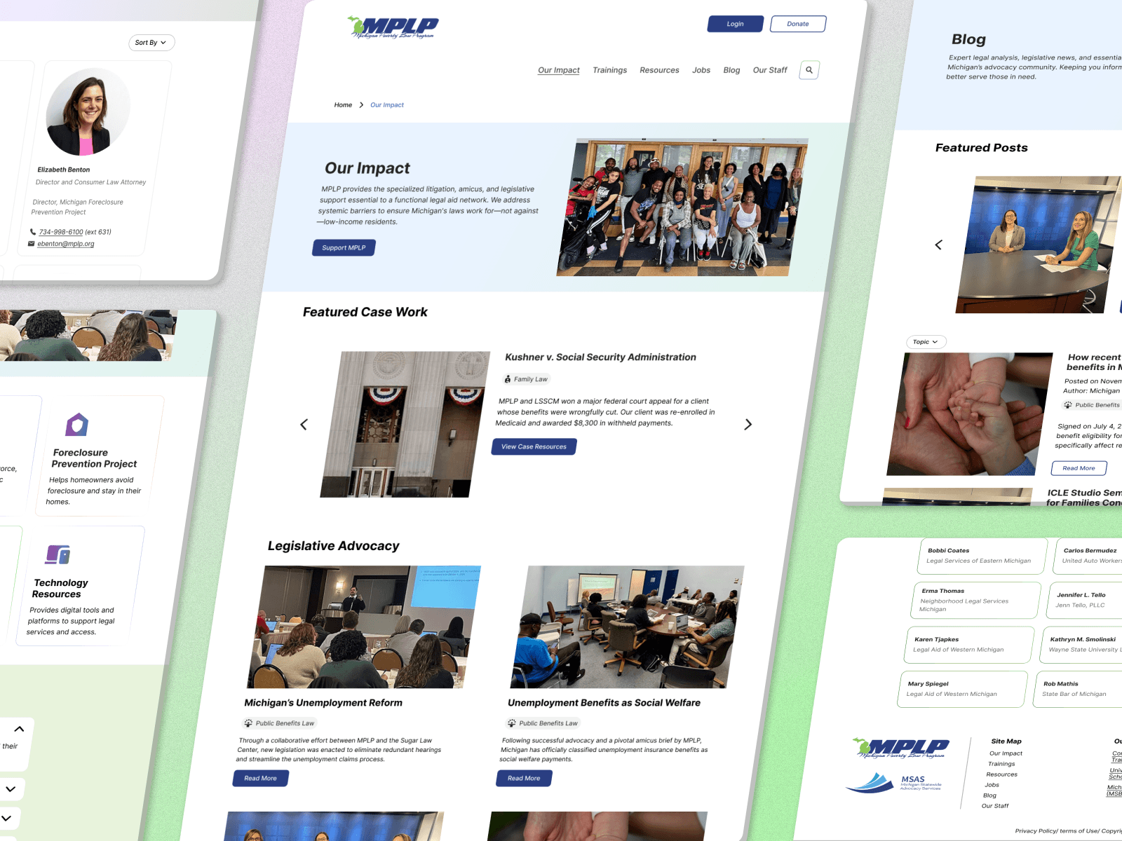
Our team divided screens amongst ourselves and iterated together from there. My initial contributions included navigation (IA brainstorming and adjustments), footer, Blog page, Impact page, Donate page, and Our Staff page. At the end of this section, you'll find a complete walkthrough of all pages that include designs created by my teammates.
Site Navigation
To improve navigation, I referenced benchmarking of other legal sites. Our Impact pages helped introduce users to the work they do and how it positively affects the communities they serve. I swapped 'Our Impact' in place of 'About Us' to match expectations and align with similar sites. In addition, I pulled 'Our Staff' out of the dropdown to improve discoverability, as this page was frequently visited via Google Analytics data, and because many interviewed users claimed they visited the site for updated staff contact info. In order to bring attention to the login and donate CTAs, I leveraged our system components for consistency across pages.
Usability Testing Adjustments: we found that few testers leveraged the search bar; we intentionally chose to reduce to an icon to increase white space and improve readability in the nav bar. We also found that dropdown items reduced discoverability of recourses—to mitigate this we transitioned to a menu-based architecture within individual pages that previously had a dropdown.


Footer
The previous site footer featured a short link list with text color that did not pass accessibility standards. In addition, the justice campaign button did not align with other CTAs, making it seem like a graphic as opposed to a button. In addition, our MPLP stakeholders explained the importance of crediting and linking to important MPLP partners in a consistent area. Due to this request, I moved them to the footer.


Our Impact Page
As mentioned above, the Our Impact page was pulled from the previous About Us dropdown to match competitors. In addition, Our Impact offers a new opportunity for MPLP to appeal to potential funders—a new stakeholder group that MPLP would like to target. I took this opportunity to improve storytelling on the page, leading funders to the bottom where they can be lead directly to the donation page and read more about how their funds can help legal aid attorneys across the region.
Usability Testing Insights: Many users found this page helpful and intuitive. They mentioned that they didn't understand the scope of MPLP's work until viewing the map section of the page which put their impact data into easy to visualize chunks.


Blog Page
Google Analytics data showed that a SNAP blog post was the most common user entry point to their site. Additionally, many legal aid professionals we interviewed claimed that they used blog posts to access resources relating to important statewide legal changes. Due to this, I felt it was integral to improve filtering—ensuring that the blog posts could serve as a helpful resource library. Additionally, I introduced a moving carousel of recent/featured blog posts that MPLP could point it's users to when for news updates.
Usability Testing Insights: With MPLP stakeholders, I discussed the potential to shift away from 'Blog' to 'News'. This adjustment would force MPLP to post smaller news updates more frequently—something their users desired, but that was not sustainable for MPLP staff given their workloads. We chose against the adjustment, but outlined strategy should MPLP be interested in shifting in the future.


Donate Page
One of MPLP's primary business goals was increasing donations and attracting new funders. Their existing Donate button redirected users to a separate sister website, taking visitors away from MPLP and missing an opportunity to communicate the impact of donations. I redesigned the donation experience to keep users on the MPLP website while highlighting how contributions support legal aid across Michigan. Additionally, research revealed that attorneys and organizations were still often unsure where to make the appropriate donation. To address this, I designed clear donation pathways that reduce confusion and guide users to the correct giving option.


Final Walkthrough
To support implementation, we provided MPLP with a phased roadmap that balanced user impact with technical feasibility. Recognizing their budget and staffing constraints, we emphasized using our Value vs. Effort Matrix to prioritize high-impact improvements that could be completed by their in-house web designer, while reserving larger initiatives for a future developer.
Build
Establish a scalable content management system, organize resources with a consistent tagging system, and implement the redesigned information architecture and login experience.
AI Enhancement
Strengthen search through structured content before evaluating lightweight AI solutions, such as a retrieval-based assistant, to ensure investments align with user needs and available resources.
Maintain & Scale
Establish ongoing content governance, regularly update resources, and continue expanding personalization and platform capabilities as the organization grows.
Civic Tech & Service Design
This project gave me a newfound appreciation for civic technology and service design. MPLP's valuable legal resources were often hidden behind poor UX, limiting their impact. Improving the experience wasn't just about usability—it was about helping legal professionals better serve communities across Michigan.
Research Value
This project reinforced the value of research in shaping confident design decisions. User interviews uncovered pain points that a heuristic evaluation missed, including users' heavy reliance on email over the website. These insights positioned the website as the primary hub for legal resources.
Sara Carrier
copyright © 2026